Graphic elements bring impact and consistency to design and photographic style in MSU communications.
Distinctive visual elements are available to help units express their identity as a part of MSU.

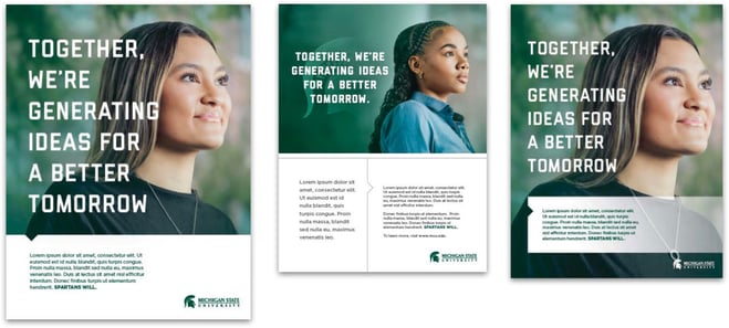
Campaign Messaging and Type Treatment
As Spartans, we are part of something bigger than ourselves. A high-impact visual style paired with strong, succinct headlines plays off these two meanings — ‘Spartans’ and ‘part of’ — to show they are inseparable.
The “I am a Spartan of” statements are most effective as headlines that incorporate the contrasting color palette rather than in running text and body copy. The headline style should focus on an impact that reinforces MSU’s brand platform and pillars. Headlines should make sense when read as "I am a Spartan of" or "I am a part of.”
When crafting headlines, use one word or a brief phrase to demonstrate high-level impact for the strongest effect. Avoid trying to communicate anything overly literal. End complete statements with a period; incomplete phrases don’t need punctuation.
Examples:
I am a Spartan of a brighter tomorrow.
Spartans of discovery
- When communicating with prospective students or potential donors, the style of these statements may be adapted to read “Become a Spartan of…” You may also adjust the association with being a Spartan depending on your audience and goals — for example, “We are Spartans of...” Hero words or phrases, which end the statements, may be used in one or more rows. However, each row, with one or multiple words, should not exceed 14 characters.
- The leading, or vertical space between lines, should be set at 1.8 times the font size. The tracking, or horizontal space between characters, can vary. The suggested baseline is 350.
- “Part of” statements should not be placed over photos unless there is sufficient contrast between the text and the photo.
- Do not use any blending modes or effects on the type.
Campaign Color Palette
The campaign features an updated Spartan palette with the introduction of a new color called Refresh Green (see Colors page). Use one of the three defined color palettes for “Part of” campaign designs to meet accessibility requirements. Do not use Kelly green, Lime green or Excellence green in the “Part of” campaign.

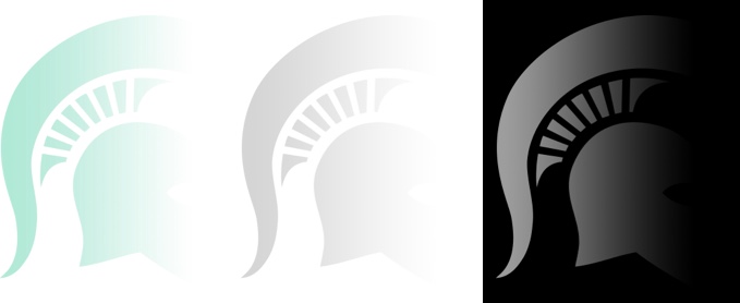
Helmet Dissolve Graphic
The Helmet Dissolve incorporates the iconic Spartan helmet into brand campaign content through a new “dissolved” effect with a fade on the left side.
- Adjusting the placement of the Helmet Dissolve’s fade is allowed if the fade remains on the left side of the helmet.
- While the plume and bottom of the helmet may be cropped out in some instances, keep the helmet’s eyes and nose visible for brand recognition.
- The Helmet Dissolve should not be placed over photos or text.
- Adjusting the dissolve is allowed for creative flexibility if the subtle, watermark-like nature of the helmet is retained.

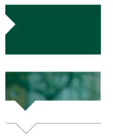
Divider
The divider is used as a visual break above a block of text or to draw the eye to a block of text. It may appear in any brand color that complements the layout in which it appears. When used in web designs, the divider should appear as it does on the MSU homepage and top-level pages.
- Always 30 px length when accompanying fonts set less than 40 pts, where it’s 50 px length when accompanying fonts greater than 40 pts.


Directional Caret
The directional caret may be used in linear form or as part of a filled shape. In both cases, it is used to draw the audience's attention to text.
EXAMPLES

Triangle Fade Graphic
A translucent green triangle is placed in the lower right corner of designs for brand advertising and other communication to drive continuity.
- The triangle fade graphic, which reflects forward momentum, grounds the design with a foundational element and provides a way to highlight the MSU wordmark.
- The triangle and its position in a design can be adapted for use in a variety of communications.
- The graphic should always appear in the Excellence green brand color.

Helmet Fade Graphic
A translucent Spartan helmet graphic can be centered behind a headline or stand on its own in appropriate applications. Use of the Spartan helmet — MSU’s most distinguishing visual brand asset — as a graphic creates immediate recognition and ownership of Michigan State University. Other expressions of the helmet can be used, such as the Helmet Dissolve in the “Part of” campaign.
- When accompanied by a photograph of a Spartan facing right, the look is a subtle way to connect with Spartans “wearing the helmet.”
- The helmet fade graphic may appear in Spartan green, Excellence green or white brand colors.
Spartan Tag Graphic
This corner tag is a simple way to integrate an MSU identifier into a variety of communications, including social media and email graphics.
- The graphic provides immediate visual recognition and continuity.
- The Spartan tag should always appear in the Excellence green brand color.
- It should not be smaller than one can read and not so large it distracts from the main image.

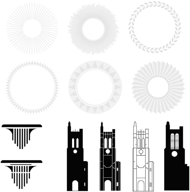
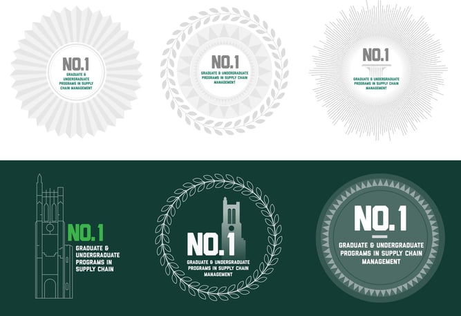
Medallions and Iconography
These graphics provide simple and effective ways to highlight brief text, including pull quotes, facts, pride points and call-to-action text. They may be combined or used on their own for visual consistency. A variety of styles reflect MSU’s excellence and proud heritage.
EXAMPLES
Want to learn more?