Color is an essential part of effective visual identity. Green and white, Michigan State’s official colors, are essential to our visual brand expression.
Spartan green is iconic. It provides an immediate emotional connection to the university, our proud history and our uncommon will to empower an extraordinary future. Think “Go Green!”
Spartan green and white are our core brand colors. (For black and white applications, and when needed for accessibility, black may also be used.)

A family of accent greens also is included in our color palette. This concise and powerful palette expands design flexibility while also ensuring accessibility, recognition and consistency.

When matching colors in the palette, consider the medium. The same color formula looks different on the web than it does printed on paper or rendered in fabric. The palette was established to provide a range of accessible colors for web and digital media.
- Each PMS ink color number translates into different formulas in different software.
- For example, PMS 567 green (Spartan green) translates differently in RGB, a hex code (for web use), in Illustrator, InDesign and Photoshop.
- Use the exact formula appropriate to each application.
- When converting from CMYK to a PDF, some color adjustment may be necessary to ensure accessibility.
Color Builds

Web Hex Values
- Spartan Green: #18453B
- White: #FFFFFF
- Black: #000000
- Kelly Green: #008208
- Lime Green: #7BBD00
- Excellence Green: #0B9A6D
- Refresh Green: #008934
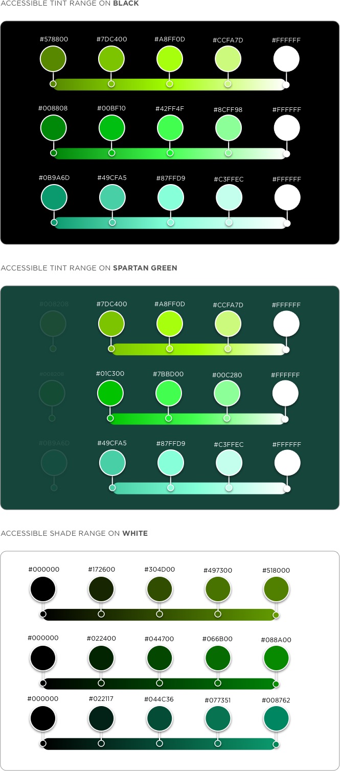
RGB/Hex Accessible Pairings
The following tool and diagrams help provide solutions to meet the Web Content Accessibility Guidelines (WCAG), which are a series of recommendations for making the web more accessible. Regarding colors, the standard defines two levels of contrast ratio: AA (minimum contrast) and AAA (enhanced contrast). The level AA requires a contrast ratio of at least 4.5:1 for normal text and 3:1 for large text (at least 18 pt) or bold text. The level AAA requires a contrast ratio of at least 7:1 for normal text and 4.5:1 for large text or bold text.
Colour Contrast Analyser (CCA)
Quick Reference Guide to Accessible Colors
Want to learn more?